Friday, March 31, 2017

Call me Tech Master

I've always thought of myself as a good tech person. I know how to use computers and different apps, I help my parents and my grandparents with their issues, and I always find a way around my technological problems. BUT I THOUGHT WRONG. I downloaded iBook author about a week ago and I still can't insert a picture into my cover!

Everytime I tied to insert a picture from iPhoto, it said that I needed to "open" it, but the application was open! The struggle was real.


HOWEVER, call me a Steve Jobs because I have figured it all out! I am using two programs... Canva and iBooks Author. How my one ask? Well, as the intellectual that I am I observed the two programs thoroughly. I realized that the design program from iBooks was not only hard to use but also just plain boring. There weren't many creative opportunities at all, shame Apple (I still love you). However, I looked at Canva and I was amazed. The options for layouts, backgrounds, and templates made iBook Author look like one of those old Nokia flip phones. The main issue afterwards was the fact that my magazine is digital and therefore interactive. I needed the interactive aspect that iBook Author offers but I also needed the design aspect available in Canva. After thinking for a while about this debacle, I had the brilliant idea to use both of this programs and create a iBook-Canna baby. What I am going to do it design the cover page, the table of context and the article layout with Canva, save it and download it as a PDF. Then, I am going to drag the PDF into iBooks where I can enlarge the PDF so that it covers the entire magazine frame and add the interactive aspects of the magazine. I hope it turns out the way I want it to turn out! Fingers crossed!!!!!! 

Look, this is what I did to try out if this idea would work. 

1. Made a little cover page in Canva and downloaded it as a PDF...
(Ignore the picture, this is not my actual picture I'm jut trying out this layout)


2. I dragged it to iBook and it ended up looking like this...


As you can see at the end, I'm still able to add "widgets" that will give the magazine its interactive aspect. 

Wednesday, March 29, 2017

Complication nation

Well, the band that I was supposed to interview bailed on me. I had a photoshoot and a video interview planned out with them this weekend but it all fell on my face when they told me they couldn't do it. I am not going to lie, I panicked, I begged, I went a little psycho. But there was nothing I could do to get them back, they were gone and I was lonely, sad, and a little crazy.

I texted all my friends. I asked everyone I knew if they knew of a band or an artist in Cypress (our school) that I could interview for an AICE Media Studies project. Thankfully, my mental and emotional health was restored when two angels from heaven called Isabella Armas and Catalina Castro who are taking the A level for this class told me that they were working with a girl named Emanuelle who was a great singer. They showed what the girl was working on, they sent me a couple of her songs, and I was instantly hooked. I begged them for an interview with this girl and they told me that they were going to film their music video at school on Monday and that I could have my interview and photoshoot with her afterwards. I was static. I am also going to email Emmanuelle the questions for the double-page spread so that she is ready for them and has thought them through.

So this is what I have in mind...
- For the photoshoot, I want to get some action shots of her actually filming her music video. It will be like an "exclusive look into Em's music video". Exclusivity is huge. However, for the cover picture I want the picture to represent the type of artist that Em is. Her music is very soulful, very personal. Through her music, you find out that she has been battling with depression, so I want the cover to be representative of music as a way to deal with life. I want the cover image to showcase her in a natural way; makeup free, no jewelry or fancy clothes just her authentic self. It is going to be a close up of half of her face, looking straight into the camera. Very simple, very honest. I am thinking of making the picture black and white, no major filters or touch-ups to represent her authenticity and her badass nature. I might do something with white body paint but Im not really set on that so we'll see how that goes. I just know that I want authenticity, I want the image to showcase her natural, true self. Because after everything she had been through, music lets her be her true self, so I want her picture to reflect this.
- For an interactive video I'm planning on doing a fun LEAST favorite things. Magazines always ask artist about their favorite food, color, number etc. But I want to ask Em her least favorite things; food, color, subject, place, song, TV Show,  and movie. I want it to be fun and quick. This will be done in the school auditorium, while the dancer portion of her video is filmed. Im hoping to have the video-making-process in the background of her interview to give the interactive video an exclusive feel as well.
- For the main interview I want to ask her about her music video mainly. What she's feeling, what her vision is, what this video represents, and what she hopes the video will achieve.

I am excited to see how this turns out, Im doing this Monday at 6:00 PM so that night I'll let you know how it turns out! Wish me luck!

Sunday, March 26, 2017

Creativity can be chaotic

So I wanna show you guys what I have in mind right now... some things have changed, some haven't, but I just want to update the "vision" that I have for my magazine.

For cover...

So when I started this I looked a lot at Billboard and at Rolling Stones but scratch that... now I'm finding inspiration in Complex.

Let's compare...


           vs.


No disrespect to Queen B, but no. Her beauty should never be disrespected by cover lines. Seriously though, I do not want my magazine to have cover lines. As I have established that my target audience will be millennials, I have to go towards the more artistic route. Less is more, a picture speaks a thousand words, etc. Millennials are innovative, different -and let's be honest- we read less! I mean Twitter is restricted to 140 characters, and between Instagram, Pinterest, and Youtube there is just a lot more visual than textual...

This Complex cover is just more appealing, more aesthetically pleasing (not just because of Zayn). It is more simplistic and minimalistic. So, it's decided, I am definitely hopping onto the no cover lines wagon.

For Double-Page Spread...


Three words... interactivity meets quirky.


It's simple. We all now that with the booming entertainment levels available everywhere and anywhere right now our attention spans have decreased. According to a USA Today article by AJ Neuharth-Keusch, 
"A 2015 study by Microsoft revealed that the average person's attention span in this wild world of technology and social media is down to eight seconds — which is less than that of a goldfish." 
Sad I know, but true! With Vogue's 73 questions we get the randomness and with Pitchfork's over/under we get the funny. I love these interviews, they are quick, entertaining, and they aren't hard to follow or tedious to watch. 

Now, with the interactive aspect of my magazine I don't know how I am going to set up the two page spread. If I do a regular two page spread and then an interactive aspect then it will definitely be a quirky and fast interview like Vogue's 73 questions with the pre-established set up found in Rolling Stones...


I still think this is the best route for be because of once again, the artist and visual aspect of it.


So yeah! There it is... a little snippet of what i have in mind right now. 


Sports, AJ Neuharth-Keusch. "NBA Will Consider Shortening Games Due to Millennial Attention Spans." USA Today. Gannett Satellite Information Network, 15 Jan. 2017. Web. 26 Mar. 2017.


Friday, March 24, 2017

Let Millennials Come to Me

When I decided that I wanted to do a music magazine, the target audience seemed clear to me. Millennials love music. With Spotify, Apple Music, Youtube, and Tidal music is constantly being shared and streamed, and no one does this better than millennials. According to study by Digital Music News, Millennials "listen to 75.1% more music on a daily basis" than Baby Boomers.

 But what I found really interesting is that apparently, male Millennials listen to more music than female Millennials do. According to an article by Spencer Kornhaber from The Atlantic, "eighty-eight percent of all Millennial males in the U.S. listen to radio each week, spending more time than their female counterparts tuned in (11 hours and 42 minutes vs. 10 hours and 46 minutes). They also show greater interest in personalized streaming audio services-think Spotify or pandora-than other demographics." Now speaking from personal experience, I can see how this is valid. I have a friend that has a Spotify playlist called "Sheesh!" for music that is "fire" and I think this is one of the the most guy Millennial things I have ever seen. He also takes pride in his playlists, they are a reflection of his entire persona, which to me is SO extra, but to each its own I guess.

However, despite this evidence, I don't want to make my magazine gender exclusive. I don't want to just target male Millennials because I mean, how un-Millennial would that be? Millennials are really great with blurring the societal lines between male and female and challenging gender roles, so why should I promote a magazine that does this? Also, in this article by The Atlantic it specifically says that "Pitchfork has faced criticism over the years for white-dude-centrisism" and I definitely do not want that. So long live men AND women because my magazine will target all of their cute butts!

The main challenge with this target audience is that honestly, magazines aren't that popular with millennials.  But, I will address this mess (look at me rhyming) by really using all the elements that millennials love to "trap them."

So let's break Millennials down.
According to an article by Jake Wobbrock from Wired millennials...
     "have become accustomed to an on-demand lifestyle, expect a seamless shopping experience, and won’t hang around for long if they don't find what they need" 

    •    Thus, my magazine will have to be easy to use, easy to find. It will be digital so that whole "at your finger-tips" thing is covered. 

    "prefer to be in the driver’s seat" (this is so ironic because they use so much Uber) "They need self-service solutions; if they can’t quickly resolve their own problems, they will give up and go elsewhere, knowing that many alternatives are just a Google search away"  

    • Once again... user friendly, simple, minimalistic. 

In addition, interactivity is huge with millennials. I want my digital magazine to have videos or artists, quizzes or polls, and to just emanate coolness. I want that "too cool for school" or rebellious, care-free attitude that millennials and hipsters love. I want to attract the artistic millennials by having cool, dope-looking pictures like Complex does. Complex is a magazine that radiates this cool factor that I crave so much. I mean look at these covers...


They are not just artistically pleasing but they are contemporary and old school at the same time. This is something that Complex completely dominates. It is sexy when it wants to be sexy and artsy when it wants to. It embodies that care-free attitude that I want because this is what Millennials go crazy for. According to an article by John McDermott for Bigiday, "Complex was third" with 20.3 million visitors or users in the Millennial category. So, they are obviously doing things right. Not only do they dominate social media usage and connectivity with users but hey also sell a "rad" product.


As you can see, there is a lot going through my head right now. When I started this process I thought I wanted one thing but now my vision is more clear and more structured I guess. I like where things are going, I think I have a more solid idea now which is pretty dope. I like this, I really do.


Kornhaber, Spencer. "Pitchfork, the Reluctant Men's Magazine." The Atlantic. Atlantic Media Company, 13 Oct. 2015. Web. 26 Mar. 2017. 

McDermott, August 27 2014by John, March 24 2017by Lucinda Southern, March 24 2017by Max Willens, March 24 2017by Sahil Patel, Sponsored By Deloitte Digital, March 24 2017by Yuyu Chen, and March 24, 2017by Lucia Moses and Shareen Pathak. "Turns out Traditional Publishers Do Just Fine with Millennials." Digiday. N.p., 11 Oct. 2014. Web. 26 Mar. 2017. 

"Millennials Listen to 75% More Music Than Baby Boomers, Study Finds." Digital Music News. N.p., 03 June 2016. Web. 26 Mar. 2017. 

Wobbrock, AnswerDash Jake. "How Millennials Require Us to Design the Technologies of Tomorrow." Wired. Conde Nast, 06 Aug. 2015. Web. 26 Mar. 2017.

Wednesday, March 22, 2017

Im Going Digital!

Hey friends! I had a nice discussion with my pals and peers this week and they helped me out a lot. I have decided that I want my target audience to be young adults. This is going to be a challenge because nowadays, with all the technology and social media, young adults don't invest a lot on magazines. Pitchfork for example, a music magazine which also targets young adults  is solely digital. They have a indie, hipster and artistic young adult fanbase. However, they only operate online. This means that if I want my magazine to have this fan base, I feel like the smartest thing for me to do is to also create a digital magazine instead of a standard one. So, my to-do-list consists of...
  1. Finish researching my target audience
    • If the magazine is going to be digital, I need to nail the aspect of technology that appeals to young adults
  2. Research digital magazines
    • If I am gonna do a digital magazine, I need to get creative. Digital magazines are a lot more interactive, more innovative than normal magazines. I need to figure out how to merge aspects of a normal magazine with a two-page spread.
  3. Learn how to use iBook 
    • Apparently iBook has this cool feature that allows you to create a digital layout or digital book, but I definitely need to look more into it and discuss my finding later on.
I have to admit, I am excited. It's going to be challenging and I might regret this as it turns from fun to stressful, BUT I'm hopeful. I have this feeling that if I get it to work, and that if it turns out the way I want it to turn out, it's going to be great. Wish me luck!

Sunday, March 19, 2017

Progress?

I found by artists people!

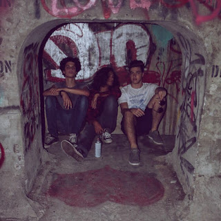
When I decided on doing a music magazine the first problem I had was that I'm not what is called a music fanatic. I don't live and breath rock and roll. I don't play any instruments. I don't even go to concerts because they are way to expensive. So, when I decided music, my first obstacle was on what the two page spread would be about. I am not knowledgeable enough to write a two spread article on music. However, like the procrastinator I am (established in my previously) my reaction was "eh, that's a problem for some other time". Well fast-foward to yesterday, I was talking to a friend about my music ignorance and he had a brilliant idea. One of his best friends is in a starting band called Castafella. This band is a small, high school band but they are definitely growing and gaining momentum. They have performed in cool venues, they have an album coming out, and they have a fan base. I also like the band's vibe, I think it will go perfectly with the artistic route that I am trying to take with my magazine

So I text the bass player known as Vinny and he was super cool, super helpful, and really interested in helping out a gal in need. His music insight combined with my magazine insight will hopefully fuse to create a dope music magazine baby. I am planning on making my two page spread an interview with the band as most music magazines usually interview artists. I am also thinking of taking the Rolling Stone's route and making the entire background of the 2-page spread a picture of the band or of the lead singer. However, since it is a band made up of puberty prone high schoolers and not just a flawless Adele I have to try this out and see if it will work out. Fingers crossed!

Here is a pictures of the band...


Friday, March 17, 2017

Two-page Spread Wonders

I've been looking at two page spreads and I just have to say, Rolling Stones is killing the game. I saw these two examples and I was astonished, completely wowed indeed.


Adele spread by Rolling Stones


Amy Winehouse by Rolling Stones


These are by far my favorite two page spreads. The main image is also the background, something common of Rolling Stones Magazine. The image becomes the most powerful and most important part of the spread, it gives the reader a feeling of intimacy with the artist. The writing is simplistic and it works around the image, not blocking it one bit. The black and white helps retain the classic tonality found in Rolling Stones, it represent simplicity and the minimalistic aura that makes Rolling Stones a classic.

The fonts use represent the artist image. For the Amy Winehouse spread the font gives off a mellow, messy and spontaneous vibe. However, for the Adele spread the fonts used are less groovy, but more classic, like Adele. Adele is a powerhouse, and the font used represents exactly that.


Wednesday, March 15, 2017

Questions Questions...

Hello party people, I am back and I am static! I've been watching some YouTube videos here and there, I've been looking mostly at interviews and questions that captivate an audience with content and originality.

First I looked at this interview on Panic! at the disco by Billboard and there were a couple of things that I liked about it...


  • It wasn't a question answer type of interview. I mean, since it's an interview there obviously were questions but the questions were edited out. I think this helps highlight the intimacy between the audience and the artist because there is no third person there, we don't hear a third person ask the questions. 


Then I looked at a series of short, quirky and random interviews by Pitchfork a digital music magazine and I have to say, this was amazing. 


  • I loved the quirkiness and the simplicity of it. It was simply fun, it didn't try to understand the artist's choice or it didn't ask about their work, or album. It has more of a get-to-know essence. It is as if we are going on an awkward first date and there has to be game invented just so that the conversation doesn't die out. Many magazines probably asked St. Vincent about her music and her inspiration, but only Pitchfork magazine asked about whether she thought ferrets were over or underrated. 


Sunday, March 12, 2017

A Blast from the Past!

It's Sunday night and I'm sitting down on my chair looking at a blank piece of paper. Im telling my brain "be unique but relatable, and edgy but approachable" and my brain is thinking about the fact that tomorrow is Monday and the time just changed so I am going to get up one hour earlier. So I do what any pro-procrastinator does; I look at the most random, unimportant, irrelevant object closest by. It turns out that this time it was a Urban Outfitters photo-booth picture of a couple of friends and I a while back. After spending around 30 minutes thinking about my friends, that picture, and that night, I think of something that is actually relevant to my project! That's what separates simple procrastinators from the true pros. Here are some of the pictures up on my board that led to this idea...


(I beg you to please ignore my face on the last photo booth picture, I don't even have an excuse for it)

Anyways, so I looked at this pictures and I said to myself, "what if I make the cover page a giant polaroid." I mean when you think about it, young adults love to bring back stuff from the past. Young adults or "millennials" are bringing back polaroids, vinyl, chokers, my school does throw-back-thursday on spirit week and 90% of the student body uniforms tie die shirts. It is "hipster" and "artsy". Nowadays old people stuff is just cool. So, I drew this...
Now I know, the potato face for the second person makes me cringe too, but this is NOT an art contest (or so I tell myself). The squiggly lines around the main image would be the coverless, and the name of the magazine always be situated in the big white space that polaroid pictures have. Also, for the time being, please ignore the name "Flow" written on the picture I drew because I just wrote it to have something there, I'm not sure what the name of the magazine will be yet. But yes! Polaroids! For now, I like this idea, I will obviously share this thought of mine with my pals and peers and I'll go from there but for now polaroids it is! 
With Love, 
Ines

Saturday, March 11, 2017

I Hear Wedding Bells

Hello again! So what’s up with my project you might ask… well, I think I have an idea! This thing I have called a brain has been working extra hard to poop out something great, and after some hard work I think it has finally done exactly that. At first, I didn’t really know what genre I was going into, but I have decided I want to do a magazine on music. How did I decide? Well I went to the local supermarket called Publix (where shopping is a pleasure) and I just stared at the magazines like a crazy person for like twenty minutes. Scanning. Judging. All the crazy stuff. Did it help? Maybe. I don’t know if it tricked my brain into getting inspiration or if I actually got inspiration from doing that but after looking at all the options, at the cover pages, at the articles, and at the different styles I went home and I opened Pinterest (my drug) and looked up “Rolling Stones magazine” and “Billboard magazine”. It is easy to say that is was if the music magazine genre proposed and I immediately screamed YAS! 

So it's settled, we are having a June wedding!

Anyways, I am currently thinking of having my magazine cover look like one of these...
Having the main photo be the artist(s), keeping that signature color palette that goes with both the artists and the magazine, and a few simple cover lines.


Friday, March 10, 2017

Hello and welcome ladies and gentleman!


 Hi there, my name is Ines Kent and I am a senior (being a senior is the highlight of my life right now) who is obviously taking AICE Media Studies. Well what can I say? Welcome! Isn't this exciting? My first blog, I am growing up I guess.
      A couple of months ago when I was a younger senior, I chose to do a magazine. Silly Ines. The time has come to start and I feel like a confused and frightened Rose in the middle of the ocean using a door as a boat. Anyways, I do have somewhat of an idea. But it’s all bits and pieces now so I’ll sleep on it, let it sink in and develop, and I’ll talk more about it later. So for now, hello and welcome! Watch silly Ines hopefully flourish and create an outstanding, inspirational, and amazing magazine.
With Love,
Ines.